before <- d[post == 0L, .(accounts = uniqueN(SK_ID_PREV),
dpd30_pct = 100 * mean(dpd30)), by = treated]2 Why the groups were never comparable
What the regression is actually holding up against what
raised is 1 for account-months running on an increased limit and 0 for everything else. “Everything else” is mostly other accounts — ones that never had an increase at all. So the comparison is between accounts, and it carries every difference between them.
                    Group Accounts 30+ dpd
                   <char>   <char>  <char>
1:     limit never raised   69,945  1.669%
2: limit was later raised   13,819  0.022%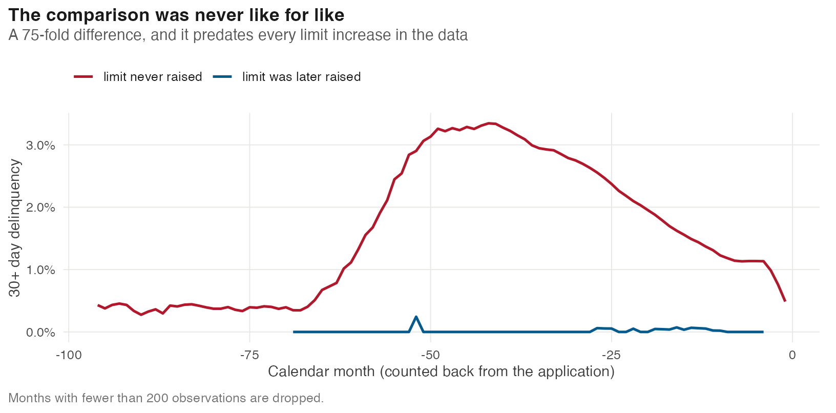
2.1 The same gap, seen a different way
The chart above splits by calendar month. Split instead by the one behavioural variable the panel carries — how much of the limit an account was actually using — and the picture is the same.
acc <- d[post == 0L, .(util = mean(utilization, na.rm = TRUE),
                       dpd  = mean(dpd30),
                       months = .N,
                       treated = treated[1]), by = SK_ID_PREV][months >= 3]

breaks_ <- c(-0.001, 0.001, seq(0.1, 1.0, 0.1), 2)
acc[, bin := cut(util, breaks_)]
binned <- acc[, .(x = mean(util), y = 100 * mean(dpd), n = .N), by = .(treated, bin)]
binned <- binned[n >= 50]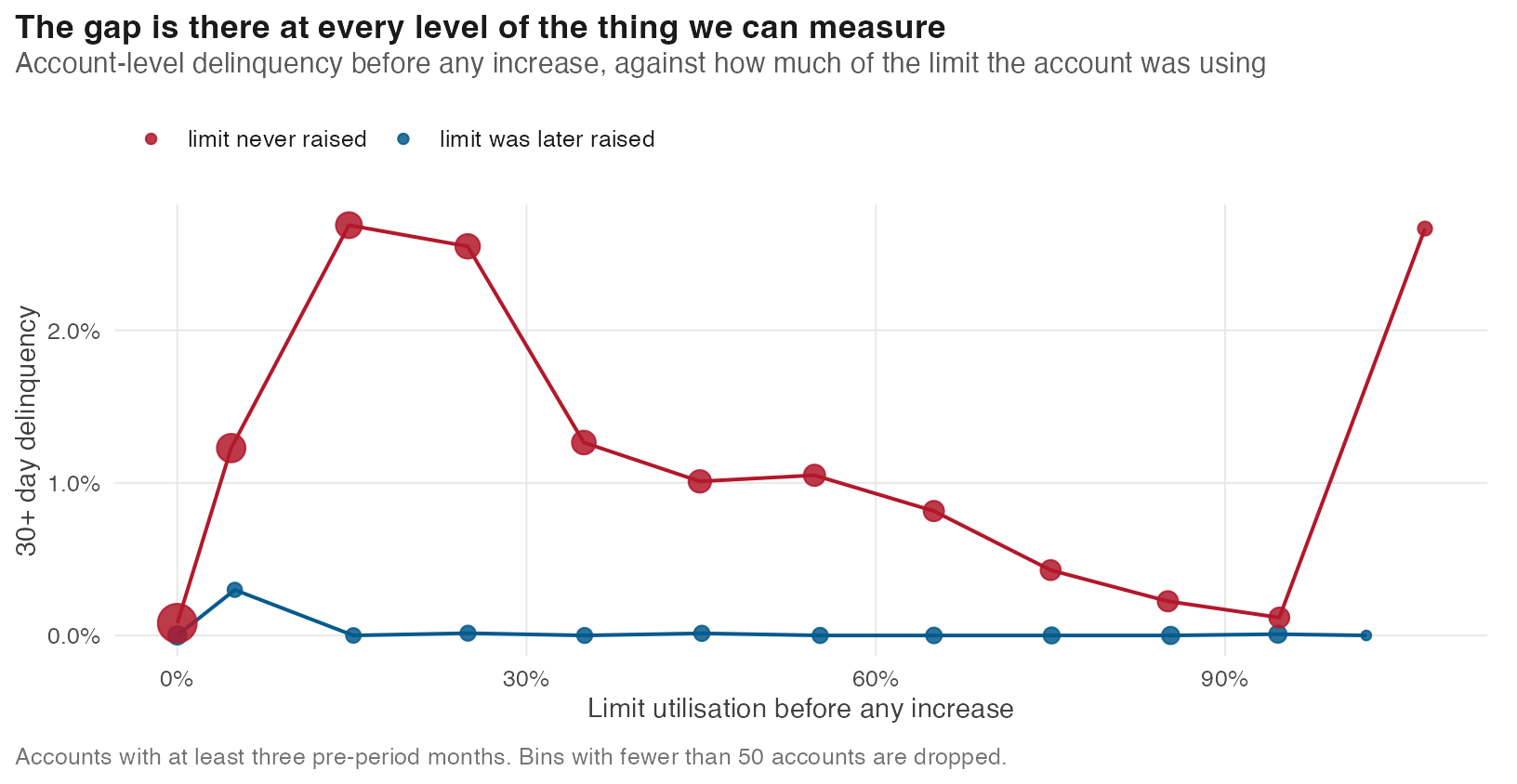
Take any vertical slice. At 25% utilisation the never-raised accounts sit at 2.55% and the later-raised ones at 0.00%. The same holds all the way across.
The blue series is flat against the floor. Accounts the lender chose to reward were barely ever in arrears, no matter how heavily they were borrowing — which is presumably why it chose them.
The accounts that later got an increase were already 75 times less likely to be in arrears — before anyone raised anything.
That is not a coincidence and it is not a data problem. It is the lender’s policy: limits go up for customers it already trusts. The regression sees healthy accounts on raised limits, troubled accounts on flat ones, and reports the difference as if the limit caused it.
The standard response is to control for the difference. Next.
Where this chapter’s code lives
Everything above runs from 02-not-comparable.qmd. Shared setup R/_common.R. The panel itself is built by R/01-build.R.